A design system is a collection of reusable components, guided by clear standards, that can be assembled together to build any number of applications. The need for a design system is to allow for scale, efficiency, and consistency in design. I took it upon myself to collaboratively design and creatively direct the creation and documentation of the design system.
Brett A - Senior Product Designer
Dave C - Senior Product Designer
Kai K - Product Designer
Amy M - Lead Product Designer
Marco D - Senior Product Designer
Jen L - Senior User Researcher
Stef W - User Researcher
David D - Senior Engineer
Megan B - Engineer
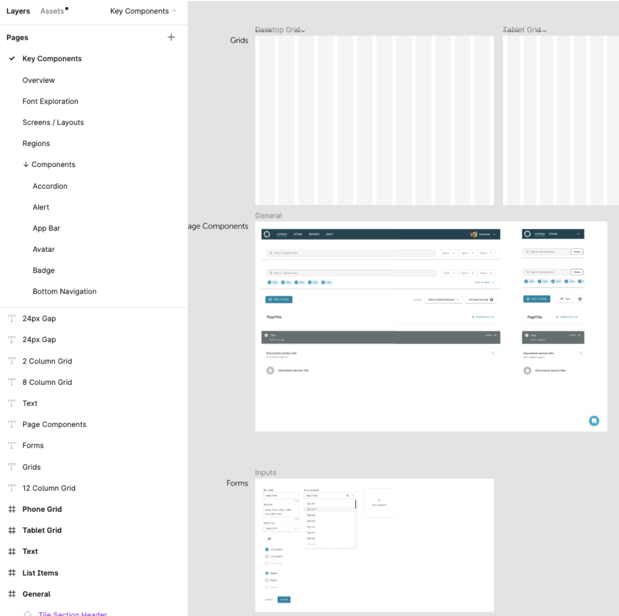
The Side design system was originally managed in Sketch and dev hand-off through Abstract. Shortly after I joined we imported all of our files from Sketch to Figma. I worked with Kai to create our file structure and page strategy. We created the initial design system foundation with colors, fonts, type sizes, drop shadows, buttons, etc. to be reference from that point on.
With the rapid growth and need to ship products quickly, Side's platform was developed with separate codebases. At first glance, each platform looked relatively polished, but upon closer inspection, it was clear that there were significant design inconsistencies throughout.
Designers were confused as the original source of truth had no maintainer and wasn’t followed tightly. Engineers were frustrated with creating duplicate components, trying to use default Material UI components, and striving to be pixel perfect which slowed them down. There was no budget or resources to create a dedicated design system team, so we simply tackled the most glaring components and styles incrementally. A desire to have some sense of parity and understanding of the current state of the platform was needed.
With the rapid growth and need to ship products quickly, Side's platform was developed with separate codebases. At first glance, each platform looked relatively polished, but upon closer inspection, it was clear that there were significant design inconsistencies throughout.
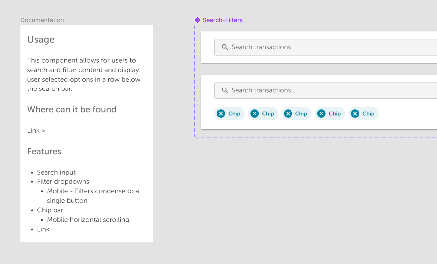
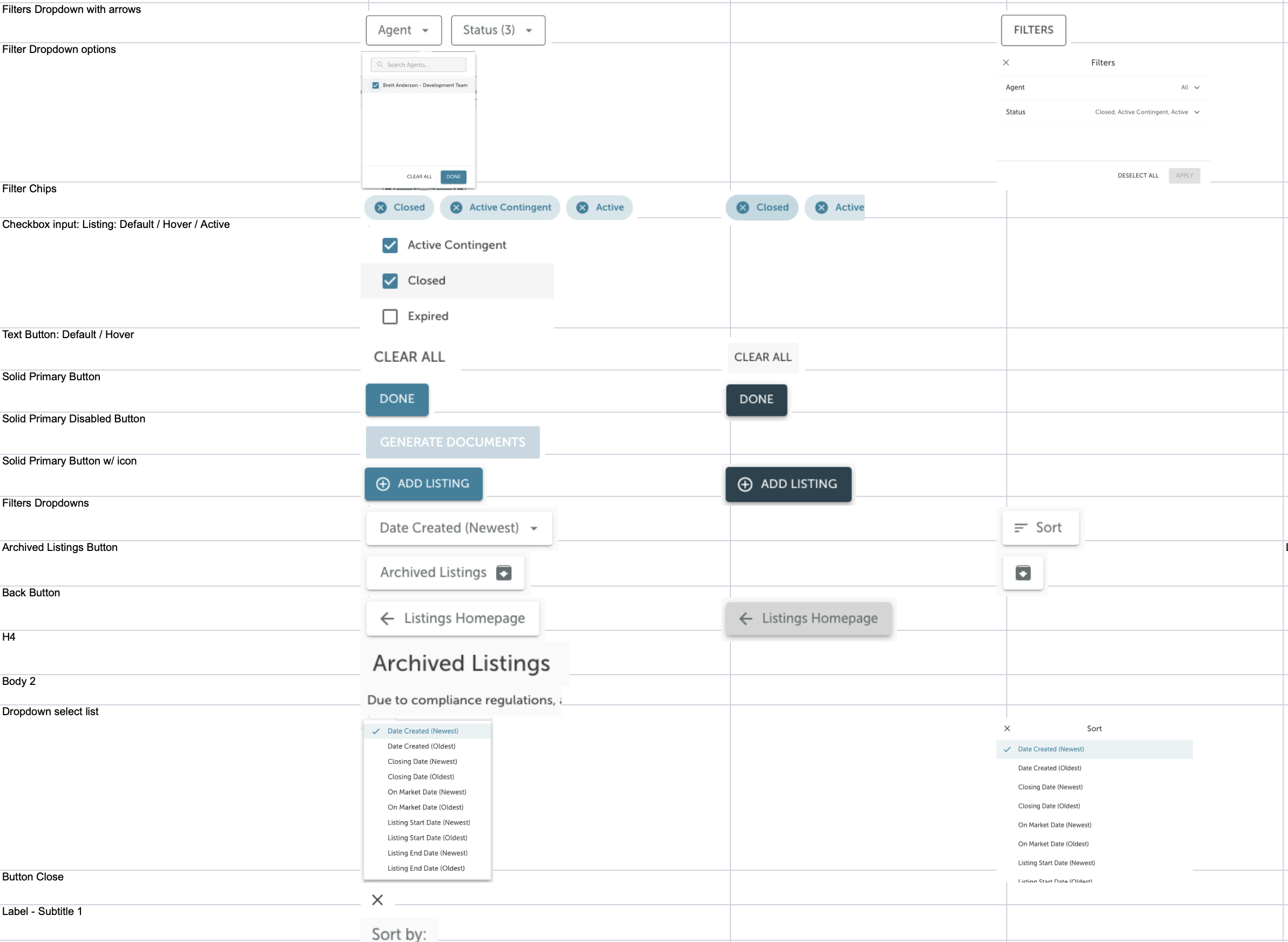
I conducted a content inventory of our products and noted down every element, where it was found, desktop and mobile views, any interaction patterns and any recommendations at the time. Next steps were to prioritize what components needed updating and add these to the roadmap.
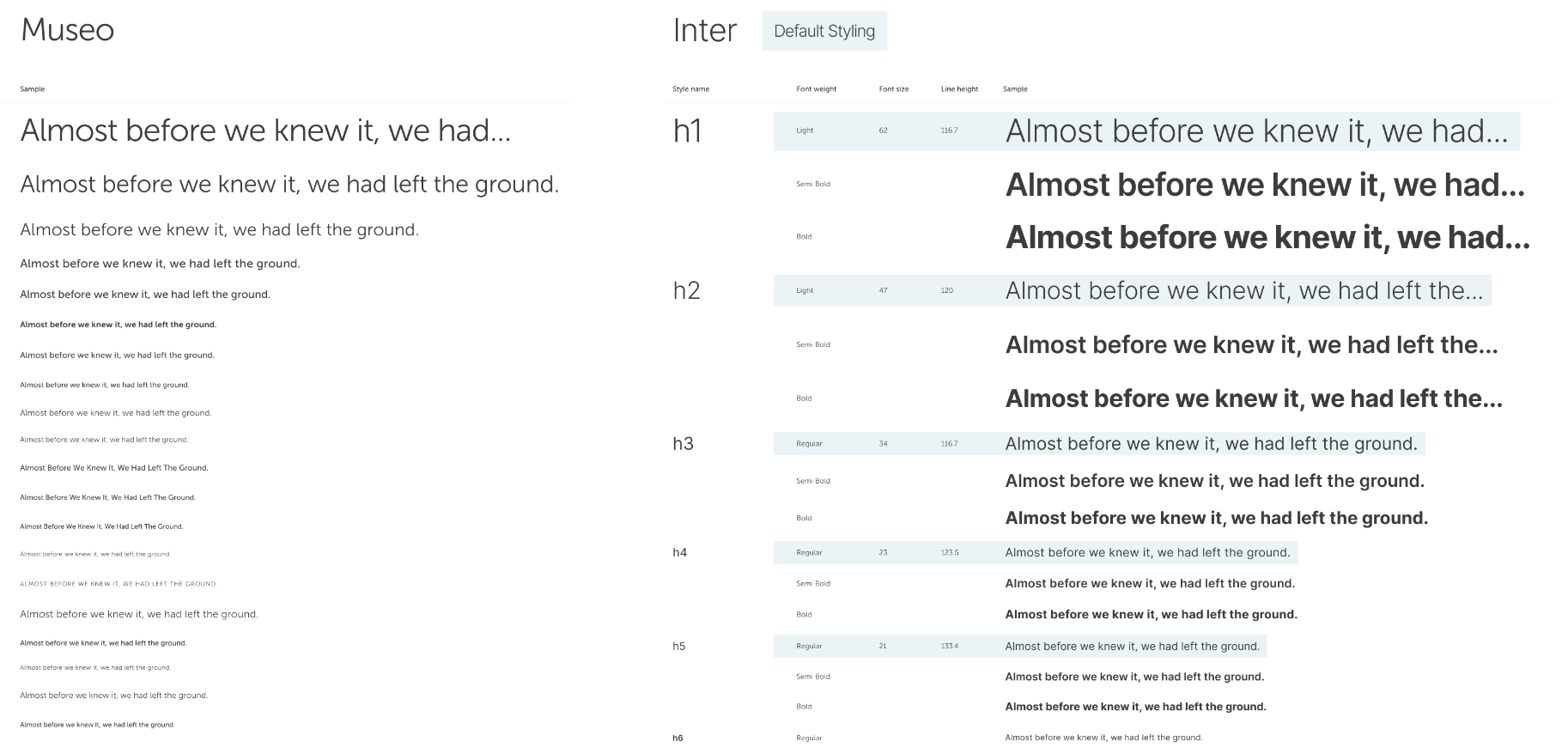
Design and Engineering teams were running into the same problem with the current font selection (Museo Sans). It was heavy to load, wasn’t suited for the legibility we needed, and the font weights didn’t match what we had in Figma. After multiple type explorations we landed on Inter for its legibility, variable font support, and load time. We worked with Engineering to get these new font sizes and weights added to Storybook.
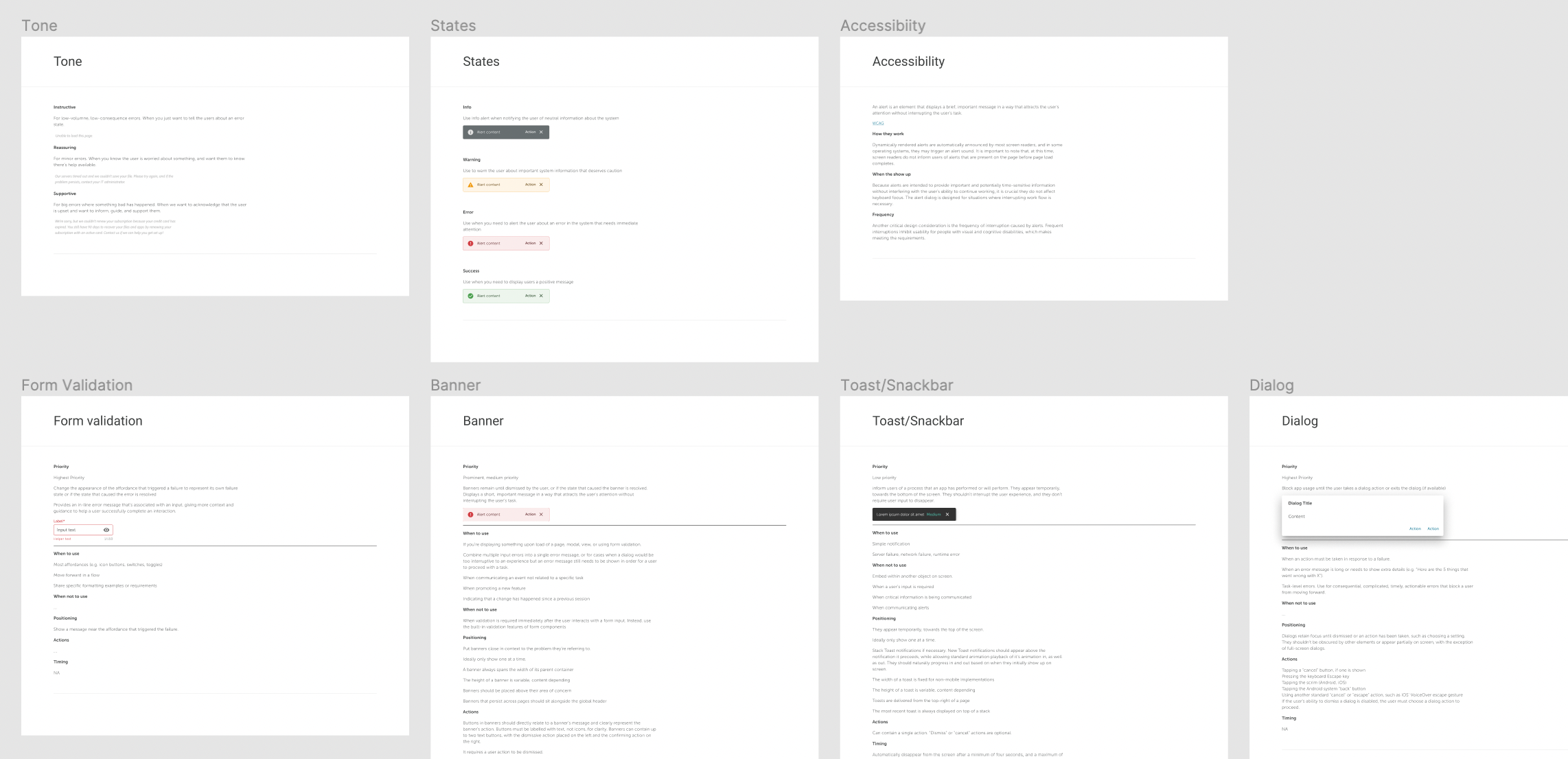
The current strategy for handling and displaying errors was inconsistent. Sometimes they would show up as banners at the top, a banner incontext, or a toast/snackbar at the bottom. We audited the current system and defined the appropriate rules for each state and type of notification.
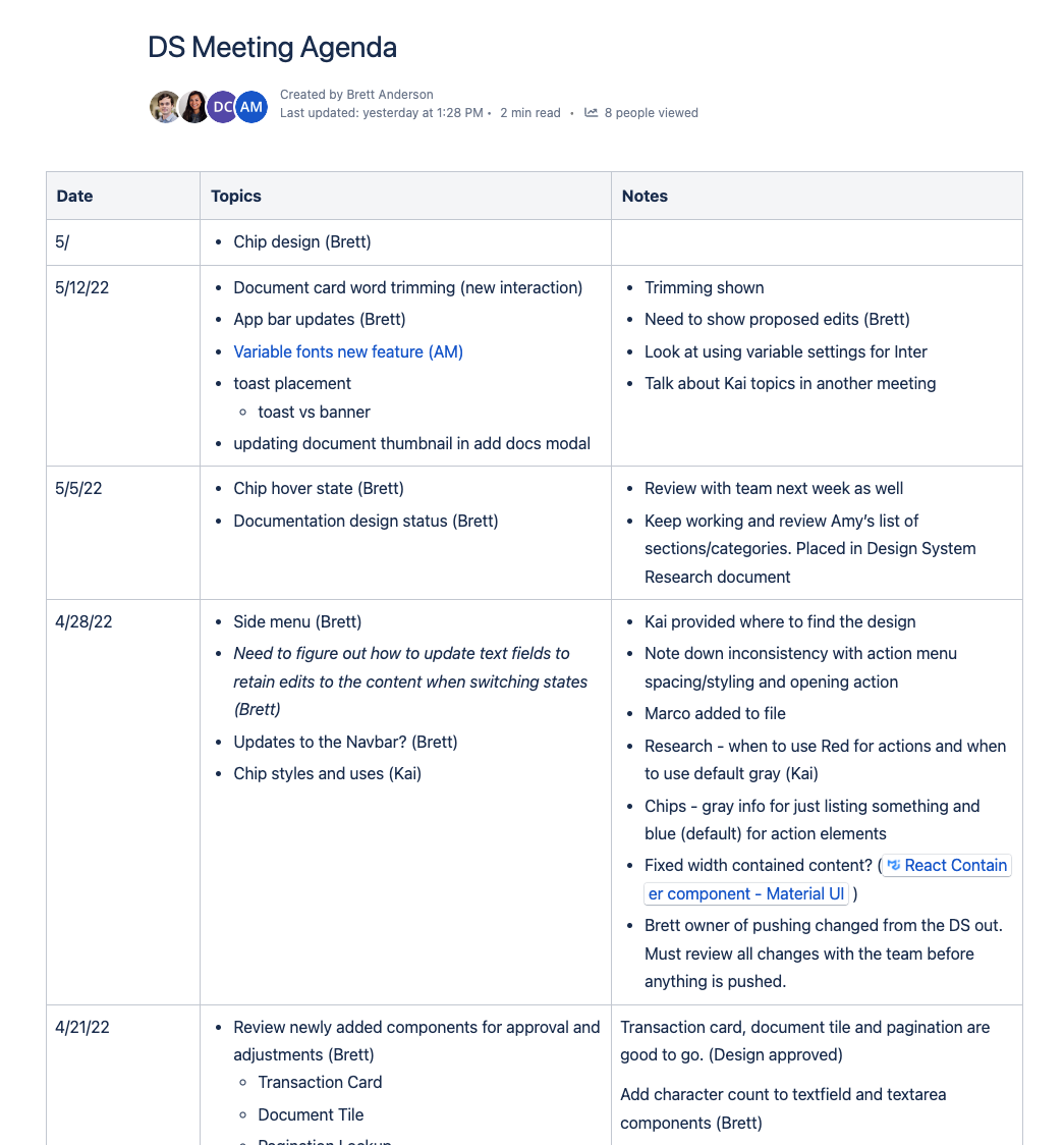
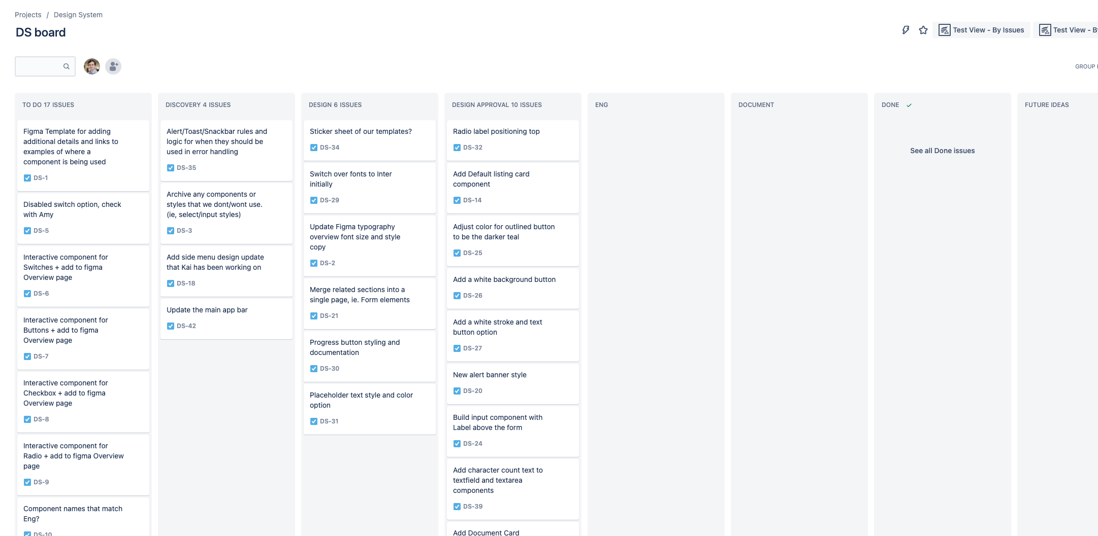
The Product Design team was small; only 4-5 designers tasked with the huge initiative to rebuild a design system while also balancing other workloads. The process of creating these standards rallied us all together for a single cause. We created an open agenda and backlog boards to keep track of our progress. Our team had some of the most productive and bonding weekly meetups and planning sessions.
It is a living system that requires an active involvement in its growth and maintenance. We need to continually document and define/redefine standards for each component.
Accessibility needs to be a higher priority and get support at all levels of the organization. We should take simple actions to ensure we are meeting compliance standards.
I would like to see us provide a monthly or quarterly email newsletter to communicate changes to the design system. This would note new components that can be pulled in from Storybook and provide insights into what the design team has planned.
Note: As of June 2022, due to volatility of the market, my work on the design system was ended due to layoffs. While I had big plans for the design system and its continued growth I’m confident the team can pick it up moving forward.
This project taught me several things. It gave me the opportunity to study some of the best design systems currently in use, hone my Figma skills, and collaborate and learn from my Design and Engineering teams. I have a newfound appreciation and love for design systems and the thinking that goes behind the decisions that are made to keep the user experience consistent.